ShopDreamUp AI ArtDreamUp
Deviation Actions

Suggested Deviants


Suggested Collections


You Might Like…


Description
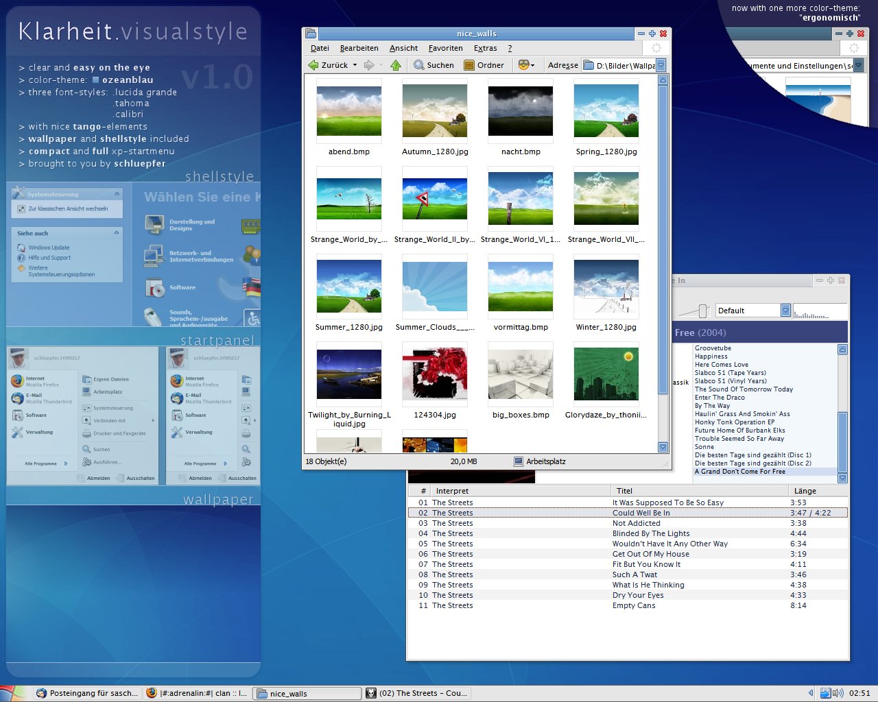
okay, here is my first visual-style for you. i always wanted to create one that is completely how i want a style to be, and this is the result... so, if you don't like it - i do (hope this doesn't sound too arrogant  (Wink)") ). of course i'm open for any bugfixes / suggestions.
). of course i'm open for any bugfixes / suggestions.
i called it "Klarheit", that's german and means clarity / clearance because that's what the style is - i didn't use some effectful gradients or spectacular light-effects, the style should be functional and still cute.
the color-theme in the style is called "ozeanblau" (oceanblue). maybe i'll release "Klarheit" in some other colors soon.
some inspirations came from the great bluecurve-theme and also from the opensource "tango-project" ([link]). i got the start-button, some caption-buttons and the icons in the xp-startmenu from there. that's why i recommend to use the visual-style in combination with the tango-icons (e.g. with "super turbo tango patcher") - looks great.
i put a wallpaper into the archive that fits quite well to "Klarheit" - it's from the human-theme, edited by me.
hope you like the style. please be kind and add this to your favourites if you like it.
p.s.: enspia ported this style to windowblinds-xp: [link]
*update 1.01 (2006-08-28):
*update 1.02 (2006-08-29):
*update 1.03 (2006-08-30):
*update 1.04 (2006-08-31):
*update 1.05 (2006-09-01):
*update 1.06 (2006-09-03):
*update 1.07 (2006-09-06):
*update 1.08 (2006-09-08):
*update 1.09 (2006-09-12):
i called it "Klarheit", that's german and means clarity / clearance because that's what the style is - i didn't use some effectful gradients or spectacular light-effects, the style should be functional and still cute.
the color-theme in the style is called "ozeanblau" (oceanblue). maybe i'll release "Klarheit" in some other colors soon.
some inspirations came from the great bluecurve-theme and also from the opensource "tango-project" ([link]). i got the start-button, some caption-buttons and the icons in the xp-startmenu from there. that's why i recommend to use the visual-style in combination with the tango-icons (e.g. with "super turbo tango patcher") - looks great.
i put a wallpaper into the archive that fits quite well to "Klarheit" - it's from the human-theme, edited by me.
hope you like the style. please be kind and add this to your
p.s.: enspia ported this style to windowblinds-xp: [link]
*update 1.01 (2006-08-28):
- now including shellstyle, compact-/full-startmenu-version and the font used in the style
- renamed compact-startmenu-version to "ozeancom" and the full version to "ozeanfull"
*update 1.02 (2006-08-29):
- radiobuttons / checkboxes improved
- progressbar much improved
- changed shellstyle again (final version i think)
- taskbar-buttons are also boxed when unfocused (very light only)
- taskbar is now a bit thinner
- updated the screenshot
*update 1.03 (2006-08-30):
- fixed shellstyle-colors (e.g. in control panel)
- reduced size of xp-startmenu (removed unneeded space)
- now three different font-styles: lucida grande (choose font-size "Normal"), tahoma (choose font-size "Large Fonts"), calibri (choose font-size "Extra Large Fonts")
- after lucida grande was included, now calibri is also in the zip
- minimal optimizations on the titlebar-gradient
- visual-style is now 7zip-packed again. you can open it with winrar or 7zip ([link])
*update 1.04 (2006-08-31):
- changed start-button (+ updated screenshot)
- made flashing / blinking button more "eye-catching"
*update 1.05 (2006-09-01):
- shellstyle: text-color in the file-details-box fixed
- applied shellstyle-colors also to the useraccounts-panel
*update 1.06 (2006-09-03):
- flashing button is now a darkblue
- increased font-size of calibri ("Extra Large Fonts") a bit, as calibri is quite small in default mode
*update 1.07 (2006-09-06):
- fixed a main-problem: java-apps now work correctly when using this style
- renamed the substyles and fontstyles to be more understandable
*update 1.08 (2006-09-08):
- added the second color-theme: "ergonomisch" (= "ergonomic"). it has got all the features of the original one (including modified shellstyle and wallpaper), is a bit darker and has less saturation. more coming soon...
*update 1.09 (2006-09-12):
- text-color of flashing-button is now white
- compact startmenu now "ultra"-compact
- small bugfixes in ergonomisch-substyle (some borderline-colors)
© 2006 - 2024 schluepfer
Comments279
Join the community to add your comment. Already a deviant? Log In
Why no .wba ?